Wednesday, 2 October 2013
Confidence intervals and funnel plots: please read this first! #1
At work, people are using more and more confidence intervals or funnel plots in their data as part of their decision making processes. Which is great!
However I think that putting them on a chart can lull people into a false sense of security. Those little lines can legitimise the labelling of points of data as outliers. People take action and make decisions based on it, so they can be dangerous. It's important to get it right, and often assumptions are made and analysis copied without much thought.
Here are the 3 of the most common mistakes I've seen:
How to reload on top of your existing data in your dashboard (bit of a cheat)
Did you know you can use a simple statement to load data back in from your own application? This is handy if you need to tweak data and avoid having to do a large reload.
Saturday, 14 September 2013
How to create 4,294,967,296 rows of data from 1 duplicate in 5 easy moves
Like this:
You load data from a source with an allegedly unique key.
Then you need to do some calculations on it, using data from other sources say, or perhaps do some calculations in the script (to make charts faster in the app) so you join the table back onto itself.
Imagine there's a duplicate, 2 lines with the same key in. When you join it onto itself, each line will replicate X the number of rows it matches in the table that you join it with. IE 2 rows will turn into 2 X 2 = 4 rows:
Data | Data_2 | Data - after join | |||||
Key# | Data | Key# | Data | Key# | Data | ||
1 | a | 1 | a | 1 | a | ||
2 | b | 2 | b | 2 | b | ||
3 | c | 3 | c | 3 | c | ||
4 | d | 4 | d | 4 | d | ||
4 | e | 4 | e | 4 | e | ||
4 | d | ||||||
4 | e |
If you were to then join the table onto itself again, each row with key #4 will join back onto itself 4 times, creating 4 X 4rows = 16.
So far so obvious.
Sunday, 24 March 2013
Qlikview Lean tips #1: How to highlight series of points that violate control rules on a chart
Highlighting patterns of points on a chart
Control charts are charts that plot some sort of quality measurement, for example number of defective goods in a batch or the weight of packets of food. The measurements are then plotted over time to see if there are any patterns. I won't go into too much more detail, because this is not the place for it (and I don't want to bore anyone that already knows it!).
You then draw "control limits" - lines above and below the average and then investigate any points that fall outside those lines, or meet some criteria. What those criteria are, and where to set the control lines are dependant on the quality control system you have in place, and the type of data etc. Lean Six-Sigma is perhaps the most famous set of rules for determining when to take action.
In general the rules are often things like:
So how do you highlight "X points in a row"?
Control charts are charts that plot some sort of quality measurement, for example number of defective goods in a batch or the weight of packets of food. The measurements are then plotted over time to see if there are any patterns. I won't go into too much more detail, because this is not the place for it (and I don't want to bore anyone that already knows it!).
You then draw "control limits" - lines above and below the average and then investigate any points that fall outside those lines, or meet some criteria. What those criteria are, and where to set the control lines are dependant on the quality control system you have in place, and the type of data etc. Lean Six-Sigma is perhaps the most famous set of rules for determining when to take action.
In general the rules are often things like:
- X number of points above the average line
- X number of points increasing each time.
So how do you highlight "X points in a row"?
Friday, 8 March 2013
Hierarchical sheets navigation in QlikView ("breadcrumbs")
Ever wondered how you can get website style navigation in QlikView?
By that I mean you start with a home page, and a menu, and as you whittle down the categories to get what you want they stick on the top of a screen with an arrow to show that you've been there. (If anyone can think of a better description then let me know...!)
edit: I've just been reminded it's also called breadcrumbs, thanks speros!
Examples:
Home>Our company>Careers>Vacancies>Vacancy search results
Someone asked me for this today. The Dashboard that I am doing for them will potentially have lots of tabs, and they might want to add and change it regularly! So I spent a while trying to get a solution that was as systematic as possible.
This is also a handy solution for applications that are going to be used on phones or tablets, as space is even more at a premium and I'd prefer this to having to scroll horizontally. (In most cases).
Oh, and I'm not allowed to use macros...
Monday, 4 March 2013
Funnel Plots in QlikView
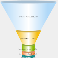
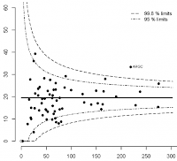
If I say "funnel plot" do you think of
This? OR this?Well I am going to talk about the latter!
Although QlikView's funnel plots are great for looking some things, statistical funnel plots are a really great tool for comparing rates across different populations.
And I'm not the only one that thinks that. I swear funnel plots must have been taught as a module in medical school. GP's are always asking for them. Now that I am developing a dashboard for a hospital trust - guess what, the consultants love them too.....! I get asked to do them so frequently (not just in QlikView) so this is my first post.
Friday, 1 March 2013
Welcome
Hi there!
I work as a QlikView developer in the NHS, (UK National Health Service), designing dashboards for NHS organisations across Britain. Along the way, I've picked up a few tips which I'd like to share with you here on this blog.
This blog isn't just for QlikViewers working in health care organisations. It's for anyone that comes across similar problems and analyses that we do. So this could be things like working with very large, complex datasets or needing the bend the rules of what QlikView can do. And particularly being able to create statistical charts.
I hope to cover topics like incorporating SPC / 6 sigma charts, matching intervals to track patient journeys and anything else that I find interesting or have been involved in!
And please feel free to leave any comments, ideas or if you would like me to explain anything a bit more.
Erica :)
Subscribe to:
Posts (Atom)