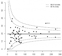
Control charts are charts that plot some sort of quality measurement, for example number of defective goods in a batch or the weight of packets of food. The measurements are then plotted over time to see if there are any patterns. I won't go into too much more detail, because this is not the place for it (and I don't want to bore anyone that already knows it!).
You then draw "control limits" - lines above and below the average and then investigate any points that fall outside those lines, or meet some criteria. What those criteria are, and where to set the control lines are dependant on the quality control system you have in place, and the type of data etc. Lean Six-Sigma is perhaps the most famous set of rules for determining when to take action.
In general the rules are often things like:
- X number of points above the average line
- X number of points increasing each time.
So how do you highlight "X points in a row"?


