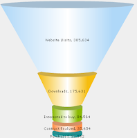
If I say "funnel plot" do you think of
This?  OR
OR  this?
this?Well I am going to talk about the latter!
Although QlikView's funnel plots are great for looking some things, statistical funnel plots are a really great tool for comparing rates across different populations.
And I'm not the only one that thinks that. I swear funnel plots must have been taught as a module in medical school. GP's are always asking for them. Now that I am developing a dashboard for a hospital trust - guess what, the consultants love them too.....! I get asked to do them so frequently (not just in QlikView) so this is my first post.
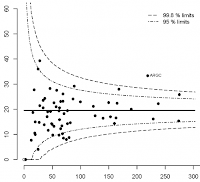
A funnel plot is really just a scatter plot of the size of the population, along the X axis versus the rate along the y axis. The average rate is plotted in the middle, along with confidence intervals which depending on the analysis you are doing could be +-3 sd, 2sd, 95% etc.
Here we are looking at A&E (accident and emergency) re-attendance rates by hospital. Each dot is a hospital and they are plotted along the X axis according to how many attendances they have had. The rate of re-attendance (the % of people that visit again within a certain time) is plotted against the Y axis. The idea is that most values will fall within the confidence interval ranges, and anything outside will be deemed an outlier.
NB: I will try and find a better dataset later - this isn't really the best example but it's getting late!
So how do we create one in QlikView? There are ways to do it:
Method #1 - Use a combo chart with the population as the dimension
This helps if you have the group population saved as a field rather than being a function of something else (eg a count). If you can't do this, then use the =AGGR() function as a calculated dimension.
eg =AGGR(count(Patients),GPPractice) would give you a list of the distinct patients counted by GP Practice.
This dimension is then set as a "continous" dimension in the axis properties and the rate calculation is set as an expression, with the display set to "symbol", in order to fake a scatter plot.
Trouble viewing the dots?
If you have issues viewing the symbols in the chart or they appear asone big squiggly line, you may need to change the "max symbols in chart setting". Change this in the document by going to settings - > user settings then the "objects tab" and change the max objects in chart figure to something large enough to display all your points. Remember this is a user setting, so it won't transfer with the document, eg onto a server. Check the same setting in the management console before you put the document live!
Confidence lines
The average, and confidences are plotted as ordinary lines on the chart. I've used normal approximations to the binomial for this example. To make the calculation easier, I've created a variable called 'p' which is just the overal average rate. The confidence intervals are set at +-95% and +-99%. The expressions I used for the lines are:
+-95%: =[Average] +- 1.96* sqrt(p*(1-p)/Total_Attendances)
+-99%: =[Average] +- 2.58* sqrt(p*(1-p)/Total_Attendances)
Individual values on the X axis
If two organisations share the same denominator (along the x-axis) they will share a point, and the data in that point will be wrong. If you add a second dimension in, that has the unique ID of the items that you are comparing (in my case the organisation id) then they will separate out on the plot.
Issues with small numbers
The confidence curves are plotted on dots that correspond to each of your points (each point effectively has a +95 point, a -95 point etc). So if you have small numbers the curve will be more "pointy"
It will technically be correct though, as any points that fall out side of their own corresponding confidence dots will still be outside the limits. It will be up to you whether to prevent the user from viewing small numbers, or maybe use the next method below:
Method #2 overlay a scatter plot with a line chart, work out the confidence lines first
You will need to work out dummy X axis values first in the script:
MaxTmp: Load max(Total_Attendances) as MaxAttends resident AEData;
let vMaxAttends = peek('MaxAttends',0,'MaxTmp');
DummyXTable: Load rowno() as DummyX AutoGenerate(vMaxAttends);
When the data's loaded, point the plots on a straightforward scatter chart. X = the denominator, Y = the rate, dimension = items that you are looking at, just as before.
The second chart is a line chart with the "dummy X" values as the dimension. The line expressions are the same as for method#1, except that they use the dummy X values as a denominator, the overall average rate as a line and the following confidence interval functions:
+-95%: =[Average] +- 1.96* sqrt(p*(1-p)/DummyX )
+-99%: =[Average] +- 2.58* sqrt(p*(1-p)/DummyX )
ie- the same as above but DummyX is our "denominator"
You then need to make sure that the limits of both charts are going to be the same. In both charts, set the Max Y as the maximum rate (aggregated on your dimension if necessary) and the Max X as the largest denominator. I've set both minimums to 0 to keep things simple but this would depend on your data.
You then need to lay the charts over each other so they fit exactly!
The best way to do this is to spend time adjusting the size of the chart above pixel by pixel in the caption settings. I like to set the line chart under neath, make the top chart transparent then set the axis on both to a different bright colour each so I can really check that I am getting them to match.
Downsides are:
Limit to number of points set in the script
Pain to move / resize
Worry incase we make any changes that could throw the charts off (eg moving from IE pligin to AJAX)
Finally
The examples are saved in the document posted here: http://community.qlikview.com/qlikviews/1378
Please do rate it if you've found it useful.
Let me know what your thoughts are. Is this something you think you could use? Any applications outside of healthcare?
Erica
-----------------------------
Some notes on using confidence intervals
I could write pages on this - but Here are some things to bear in mind when using confidence intervals in general.
- Here I've used the bog-standard normal approximation to binomial to work out the limits, but please don't just copy what I've done. There are better, but more complicated methods for approximating binomal data - and your data might not be binomial but better suited to another distribution eg poisson (for events within a timeframe).
- Think about where to set the limits. 95% confidence sounds high, but it really means that 5% of the items will fall outside the range due to chance. That's 1 in 20. So if you were looking at 20 items, you would expect 1 to naturally fall outside the boundaries anyway. You can correct for this by shrinking the confidence intervals - see link to Bonferonni correction below
- Working in the NHS I often come across datasets that have been calculated on "weighted" populations or "adjusted" populations. As the variance changes with the actual population you won't be able to just plug the numbers in and use them for the X axis, so please beware!
More useful resources on funnel plots here:
http://www.erpho.org.uk/viewResource.aspx?id=14838
Including excel templates and formulas.
A&E Data freely available at:
http://www.ic.nhs.uk/searchcatalogue?productid=11213&topics=0%2fHospital+care&sort=Relevance&size=10&page=1#top
Good wikipedia page on Bonferonni Corrections
http://en.wikipedia.org/wiki/Bonferroni_correction


Excellent article -I'm unable to download your example as I'm using Personal Edition. I've also developed a funnel chart in QlikView based on A&E attendances per 1,000 Practice list size as part of an Urgent Care dashboard - it isn't perfect but I'm fairly new to QV so I'm still learning. My next task is to try and plot attendances by postcode.
ReplyDeleteKeep the blogs coming!
Regards, Jim
Hi Eric's, thanks for posting another great blog. The link to the qlikview community post is coming up with an unexpected error on the community website. Is there any other way to make the qlikview example available? Thanks again. Dan
ReplyDeleteApologies, that should have said Erica....not Eric's
ReplyDeleteWonderful Tips for using QlikView in Healthcare you shared, I wish every blog was as informative as urs. thank you and keep up the good work.QlikView Training in Hyderabad
ReplyDelete“Associative” puts emphasis on understanding how sets of data relate to one another
ReplyDeleteAll those tricky SQL queries involving “NOT EXISTS” or “LEFT/RIGHT OUTER JOIN” are but a mouse click away.This is one of the most incredible blogs on qlikview Ive read in a very long time. The amount of information in here is stunning, like you practically wrote the book on the subject. Your blog is great for anyone who wants to understand this subject more. Great stuff; please keep it up!.thanks.qlikview training in hyderabad
Hi Erica, do you have a link to your example ?
ReplyDelete